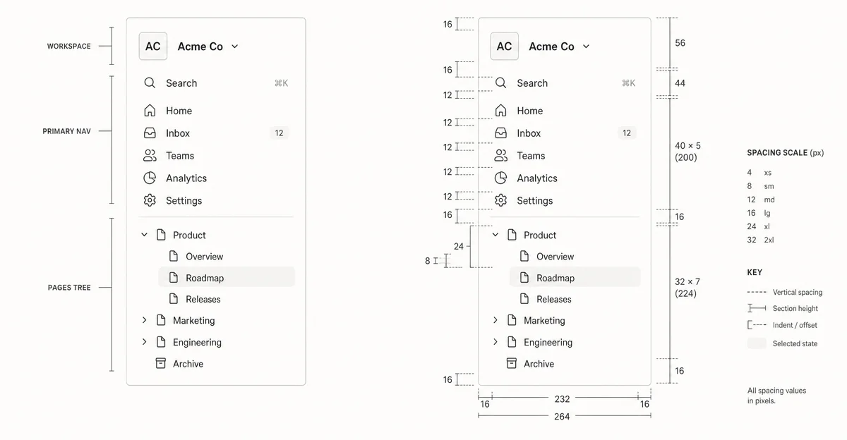
Notion's sidebar: how 224 pixels make navigation invisible
A dimensional teardown of Notion's left sidebar — breaking down the 8px grid logic, hover-reveal micro-interactions, four-tier information hierarchy, and the timing decisions that make 40 pages feel like 10.

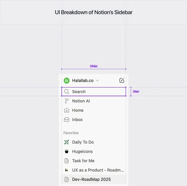
Notion's left sidebar is 224 pixels wide. That number isn't arbitrary — it's the result of a deliberate constraint: wide enough to display most page names without truncation, narrow enough to leave the document canvas dominant. Today we're tearing apart this single strip of UI to see exactly how Notion's team made decisions around information hierarchy, whitespace, state changes, and micro-interactions.
The screen: Notion's left sidebar (macOS desktop, default workspace view)
Information hierarchy: a four-tier stack
Open Notion for the first time and you notice the sidebar reads top-to-bottom without friction. That's not an accident — the ordering encodes a strict priority model:
- Workspace identity (top): the workspace name and avatar. This is the orientation anchor — it answers "where am I?" before anything else.
- System tools (Search, Notion AI, Home, Inbox): these are universal, always-present actions. They sit above the fold because they don't depend on what you've built; they're the same for every workspace.
- Curated shortcuts (Favorites): pages you've manually elevated. The section is visually lighter than the system tools above — smaller section label, less visual weight — because it's personal, not universal.
- Raw content tree (Teamspaces, Shared, Private): the actual page hierarchy. This occupies the most vertical space because it scales with the user's work, but it sits lowest in the hierarchy because it requires context to parse. 1
The transition between tiers 2 and 3 is marked by a 6px gap — small enough to keep the sidebar unified, large enough to register as a boundary. That number shows up repeatedly in the sidebar's spacing logic: it's not a full separator (which would use 16–24px), but it's perceptible at a glance. 2
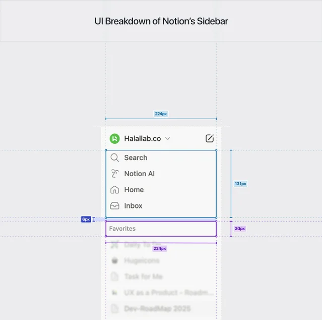
The section headers (Favorites, Private, Teamspaces) use gray uppercase text rather than full-weight labels. This is a deliberate demotion: the headers tell you what zone you're in rather than what to do. They're navigational signage, not CTAs. Reducing them to muted gray prevents them from competing with page titles, which carry the real decision-making weight.
Whitespace: the 8px grid and what it buys
The entire sidebar runs on an 8px grid. Every item row is a multiple of 8px tall. Icon sizes (22×22px) align to the grid. Internal padding on each row — 8px horizontally, 4px vertically — keeps items touchable without wasting height.
Why 8px and not 10? The 8px base aligns to the even pixel densities that most displays use (1×, 2×, 3× DPR), which means grid lines land on crisp pixels rather than half-pixels that render blurry. It also divides cleanly into 4, 16, 24, and 32 — the standard sizes for icons, component gaps, and touch targets. Using a 10px grid would create fractions at 5px (half a unit) that don't divide cleanly into icon sizes, which are almost always powers of 2. This is a constraint baked into how display hardware works, and Notion's sidebar lives entirely within it. 2
The practical result: the sidebar feels calm. Even when a workspace has 40+ pages, the consistent row height creates a rhythm that prevents cognitive overload. You scan vertically; you're not wrestling with irregular intervals.
State changes: three layers of affordance
The sidebar communicates interactive state through three layered signals, each lighter than the last:
Layer 1 — Active page: a low-opacity gray fill behind the current page row. Notion doesn't use color to mark the active item (no blue, no accent). They use a neutral tint that differs only in luminosity from the sidebar background. The reasoning: color means something in Notion (it's used for page icons, tags, and callout backgrounds). Using color for hover/active state would create ambiguity. Luminosity alone carries the state signal without competing with meaning. 3
Layer 2 — Hover: on hover, the row background shifts from transparent to the same neutral tint. The transition is near-instant — around 80–100ms — fast enough that it doesn't feel animated, slow enough that the eye registers the change. At lower speeds (200ms+), hover states feel heavy and laggy in navigation contexts because the user's cursor is already halfway across the screen.
Layer 3 — Hover reveal: on hover, two secondary actions appear at the row's right edge — a
••• (more options) menu and a + (add subpage) button. These are hidden by default because showing them at rest would add visual noise to every single sidebar row. The hover-reveal pattern communicates: "these exist, but you don't need to see them until you're focused on this item."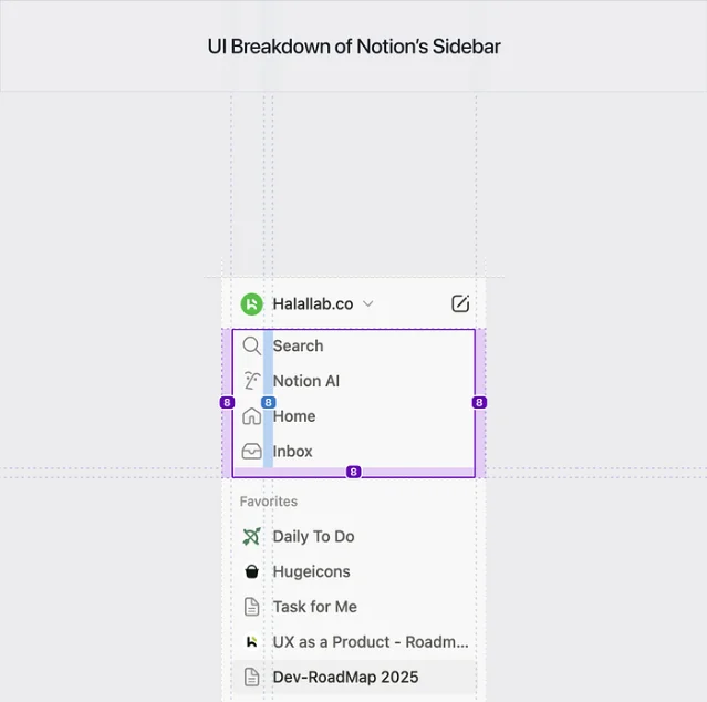
The collapse triangle (the
▶/▼ icon that expands nested pages) also falls into this pattern: it's semi-invisible at rest and strengthens on hover. The reasoning is priority: the sidebar's primary job is navigation, not tree manipulation. The collapse affordance being secondary (hover-only) keeps it from cluttering the reading state.Micro-interactions: the details that signal craft
The collapse animation: when you expand or collapse a page's children, the tree opens/closes with a smooth height animation rather than snapping. The duration is approximately 150–200ms with an ease-out curve. Ease-out for spatial expansion (fast open, slow settle) matches the physics of opening a physical drawer — the kinetic energy dissipates at the end. The content appears to "arrive" rather than "flash in."
Drag-to-reorder: drag a page in the sidebar and you get real-time reorder preview — the other items step aside to show the insertion point. The drag item itself floats at reduced opacity (~0.7), separating it visually from items still in their resting state. This distinction prevents the user from misreading the current arrangement as final until the drop commits.
The
+ new page button: hovering any section header reveals a + button at the right edge. It appears with a short fade (roughly 100ms). This delay is intentional — immediate appearance on hover would cause the button to flash on every accidental cursor pass, which is visually noisy in narrow screen regions. The 100ms filter acts as an "intent threshold": if you move through quickly, nothing happens; if you pause, the option surfaces.Keyboard shortcut as design signal:
cmd/ctrl + \ toggles the sidebar. The fact that a shortcut exists for this — and that it's documented prominently in Notion's help — tells you Notion's design team modeled a use case where the sidebar is regularly hidden. The toggle is a feature, not an escape hatch. Full-screen document editing is a supported, first-class mode. 1What PMs can take away
The Notion sidebar doesn't do anything novel — trees, hover states, and 8px grids predate Notion by years. What it does is execute each decision at a level of specificity that most teams skip. The 6px inter-block gap, the 22px icon grid lock, the 100ms intent delay on the
+ button — none of these are default values from a design system kit. They're argued decisions. That's the gap between a sidebar that "works" and one that feels right at 40 pages deep.The most transferable pattern: hover-reveal for secondary actions. If your product has per-row actions (delete, edit, move), hiding them until hover keeps the resting state scannable. The rule for choosing what to hide vs. show is: anything the user needs to find their destination stays visible; anything that modifies their destination stays hidden until intent is established.
Add more perspectives or context around this Drop.